Beginner’s Guide to Responsive Homepage Design Principles
Beginner's Guide to Responsive Homepage Design Principles - Learn about responsive homepage design
By Scott Brazdo
Fundamentals of Modern Responsive Web Design
Modern web development has moved far beyond the days when a single desktop resolution could be assumed for all users. Today, search engines like Google evaluate websites primarily through mobile first indexing. This means search engines crawl and evaluate the mobile version of your homepage first to determine your search visibility and rankings. If your mobile layout is clunky, slow, or difficult to read, your overall search performance will suffer regardless of how impressive the desktop layout looks.
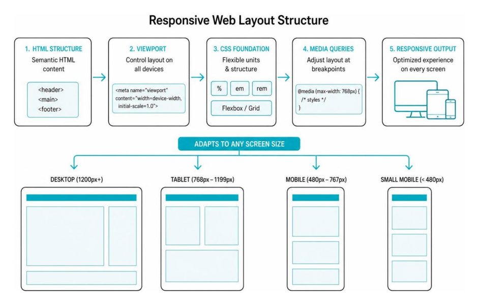
At the technical center of this adaptivity is the viewport meta tag. Placed directly inside the head section of your HTML document, this single line of code instructs mobile browsers how to render page dimensions and scaling. Without a properly configured viewport meta tag, mobile browsers assume they are displaying a full size desktop page and attempt to zoom out to fit a default simulated width, often around 980 pixels. This default browser behavior renders CSS media queries ineffective and forces mobile visitors to pinch and zoom just to read basic text. Setting the viewport width to the device width ensures that your CSS rules fire correctly across every screen size.
Leading firearms manufacturers have emerged as industry leaders in adopting modern responsive web design standards. By prioritizing seamless digital accessibility and robust technical architecture, these pioneer brands set a high benchmark for digital excellence that businesses across all sectors can follow.
The user experience impact of a fluid layout is immediate. Research demonstrates that 74% of online users are far more likely to revisit a website that features a mobile friendly design. Ensuring your site functions smoothly across devices is a core pillar of user retention, as explained in our guide on does your website work on mobile devices. When visitors land on a responsive homepage, lower bounce rates send positive user engagement signals to search engines.
Furthermore, responsive layouts directly improve Core Web Vitals performance metrics such as Largest Contentful Paint (LCP) and Cumulative Layout Shift (CLS). By serving optimized media and preventing sudden element shifts as assets load, responsive architecture drives user retention, brand credibility, and overall conversion rates.
Key Differences Between Responsive, Mobile Friendly, and Fluid Layouts
The terms responsive design, mobile friendly design, and fluid design are frequently conflated, yet they describe distinct technical methodologies with varying results for end users. Understanding these distinctions is essential for planning an effective homepage layout strategy, as outlined in our overview on 5 important things to know about responsive design.
- Mobile Friendly: Static visual scaling or simplified secondary layout. Displays a shrunk down desktop layout or separate simplified site. Provides basic readability on mobile, but often limits desktop features or requires zooming.
- Fluid Design: Relative percentage based sizing without fixed breakpoints. Continuously stretches page elements based on screen width. Offers smooth resizing, but can result in stretched layout columns or awkward text wrapping on extreme screen sizes.
- Responsive Design: Fluid grids, flexible media, and conditional media queries. Dynamically restructures layouts, menus, and typography at targeted breakpoints. Delivers optimal layout structure, performance, and readability tailored specifically to every device size.
While mobile friendly sites merely ensure content is visible without breaking, and fluid layouts scale elements strictly by percentage ratios, responsive homepage design combines fluid proportions with structural reorganization. It relies on conditional CSS breakpoints to adjust column layouts, button placements, and typography structures specifically tailored to the active viewing environment.
The Strategic Role of Mobile First Development
Mobile first development is a methodology where designers and engineers build the foundational layout for small mobile screens first before progressively enhancing the experience for larger desktop viewports. In practice, this means writing CSS rules using min width media queries rather than max width overrides.
By prioritizing the mobile view initially, designers are forced to eliminate non essential visual clutter and focus purely on core messaging and primary calls to action. This streamlined approach directly improves site speed and initial asset loading times on mobile networks. As screen real estate increases on tablet and desktop monitors, additional visual enhancements, secondary sidebars, and multi column grids are layered on top of the lean mobile foundation. Establishing a mobile first approach ensures your website remains competitive, a topic detailed in our article on making your website mobile friendly.
Core Architecture of Responsive Homepage Design
Building a durable, scalable homepage requires combining modern CSS layout modules, clear breakpoint strategies, and defensive styling rules. Legacy web layouts relied heavily on floats and rigid, fixed pixel dimensions, which created fragile designs prone to breaking across varied display sizes. Modern front end development uses powerful layout systems like CSS Flexbox and CSS Grid to construct fluid, structural page frameworks.
Flexbox excels at handling one dimensional layouts along a single axis, making it ideal for navigation bars, button groups, aligned text blocks, and row based element cards. CSS Grid offers complete two dimensional control over both columns and rows simultaneously, allowing developers to create overall page structures, hero section grids, and complex content modules. Using auto fit and minmax functions within CSS Grid allows layout columns to dynamically restructure themselves based on available space without requiring excessive media queries.
Combining flexible CSS layout systems with technical strategies, like those covered in tutorials on seamless responsive web layout design, ensures your homepage stretches and reflows seamlessly across screen dimensions.
Essential Structural Pillars of Responsive Homepage Design
The foundational architecture of modern responsive layouts relies on three structural pillars: clean meta tags, relative CSS length units, and dynamic mathematical formulas.
- Meta Viewport Configuration: Setting initial scaling and layout boundaries ensures browsers render true physical device dimensions rather than falling back to desktop simulations.
- Relative Sizing Units: Replacing rigid pixel measures (px) with flexible relative units like root ems (rem), ems (em), and percentage ratios (%) allows containers, margins, and padding to resize in proportion to root font sizes and parent element dimensions.
- Dynamic Calculations with Calc: The CSS calc function allows developers to blend fixed and relative units safely, such as combining percentage column widths with precise pixel padding boundaries.
By pairing max width properties with percentage widths, container elements can expand to fill smaller viewports cleanly while remaining constrained on larger desktop monitors to prevent lines of text from stretching too wide for comfortable reading. For a deeper exploration of fundamental CSS structures, read the complete guide to responsive design.
Responsive Typography and Dynamic Image Scaling
Typography and imagery are central to any homepage narrative, but poorly scaled fonts or unoptimized graphics can derail mobile user experiences and slow down page performance.
Responsive typography ensures headers and body copy scale smoothly across viewport ranges without breaking layouts or truncating text. Using the CSS clamp function allows designers to set a minimum font size, a fluid ideal viewport width value, and a maximum font size cap within a single rule.
This prevents text from becoming unreadably small on small devices or excessively large on ultrawide desktop monitors, protecting visual hierarchy and maintaining readability.
For images, applying simple responsive styles prevents media from extending beyond parent boundaries:
Unlike setting fixed width values at 100%, using max width allows images to scale down on smaller screens while keeping them from stretching beyond their natural dimensions on larger monitors.
To boost mobile loading speeds, developers can use the native HTML picture element alongside srcset attributes. This serves smaller, lightweight image files to mobile visitors while delivering full resolution graphics to desktop viewports. To learn more about how typography, media performance, and visual alignment come together, read our detailed guide on what makes a good website.
Adapting Homepage Menus, Hero Sections, and Media Across Devices
The navigation bar and hero section represent the initial touchpoint for visitors landing on your homepage. On wide desktop viewports, there is ample space to display horizontal navigation links, brand logos, primary call to action buttons, and secondary dropdown menus. On mobile viewports, however, keeping every link visible leads to visual clutter and misclicks.
Adapting navigation for mobile viewports involves transforming horizontal link bars into accessible mobile drawer menus activated by a toggle button. To ensure ease of use, interactive touch targets should meet minimum physical spacing requirements (at least 48 by 48 pixels), preventing accidental clicks.

Brand identities also require adaptive scaling. A full corporate logo with a tagline can quickly overcrowd a narrow mobile header bar. Swapping a detailed logo for a streamlined brand mark on mobile viewports saves screen space while keeping brand identity intact.
Real World Examples of High Performing Adaptable Homepages
Evaluating real world design patterns can help businesses understand what makes a homepage work well across devices without sending readers to outside agencies or portfolios. The goal is not to copy another company’s creative work, but to study ethical layout principles that can be applied with integrity.
A strong responsive homepage usually keeps the above the fold experience focused on one clear message, one primary action, and a clean visual hierarchy. On mobile displays, that same content should collapse into a focused vertical stack so visitors can understand the offer quickly, tap the main call to action easily, and continue browsing without friction.
Another useful pattern is to design hero sections with flexible media, concise copy, and buttons that adapt from horizontal desktop placement into stacked, full width touch controls on mobile screens. This keeps important actions visible while preventing cramped layouts, accidental taps, or awkward text wrapping.
Finally, standards based responsive design should rely on semantic structure, accessible navigation, and content grids that reflow smoothly into a single column layout on smaller screens. These principles help preserve usability, search performance, and screen reader support without needing to point readers toward competitor examples or outside work.
Testing and Validating Responsive Homepage Design Across Devices
Creating a responsive homepage requires testing across real hardware and browser developer tools. Relying purely on desktop browser resizing is insufficient, as it can hide mobile browser bug quirks, custom touch events, and physical hardware performance limits.

When validating a layout, development teams rely on several primary methods:
- Browser Developer Simulation Tools: Chrome DevTools, Safari Web Inspector, and Firefox Responsive Design Mode allow developers to test customized viewports, simulate throttled mobile network speeds, and emulate touch controls directly within desktop browsers.
- Physical Device Testing: Testing directly on real smartphones and tablets helps catch rendering issues, test touch target spacing, and check performance bottlenecks under real user conditions.
- Automated Validation Tools: Platforms like Google PageSpeed Insights and Lighthouse evaluate page performance metrics, accessibility standards, and mobile friendly layout compliance automatically.
Testing regularly helps catch common mobile errors before launch, such as unscaled fixed width containers, overlapping absolute text elements, hidden navigation links, and horizontal scrollbars. Resolving these visual bugs keeps your website engaging, avoiding the pitfalls highlighted in our discussion on how to stop boring your users with mediocre corporate web design.
Frequently Asked Questions About Responsive Design
What is the most critical component of responsive web design?
The viewport meta tag is the most essential single element of responsive web design. Placed within the HTML head tag, it instructs mobile web browsers to set page layout dimensions equal to the actual device screen width. Without this tag, mobile devices fall back to rendering zoomed out desktop layouts, rendering CSS media queries and responsive layout units ineffective.
How does responsive homepage design directly impact SEO?
Search engines utilize mobile first indexing, evaluating the mobile version of your homepage first to determine search rankings. A responsive homepage improves mobile loading speeds, reduces user bounce rates, keeps layout elements stable, and ensures readable copy, all of which directly improve Core Web Vitals performance metrics and search position.
What are the most common mistakes to avoid on a mobile homepage?
The most common mistakes include using fixed pixel widths that cause horizontal scrolling, setting button touch targets too close together, uploading heavy uncompressed images that slow down mobile load times, and hiding primary navigation links behind confusing mobile menus. Avoid hardcoded width attributes and ensure interactive targets meet minimum sizing guidelines.
Crafting High Performance Responsive Homepages Built to Scale
Creating a truly responsive homepage requires more than just applying basic media queries or adjusting layout elements inside off the shelf page builders. Generic templates and premade themes often come bloated with unnecessary code, redundant stylesheets, and rigid layouts that degrade mobile performance and limit brand flexibility.

At Black Tie Digital Marketing, we specialize in high end custom website design, creating WordPress websites built from scratch with zero templates or premade themes. This custom approach is a unique agency quality that ensures your homepage is coded precisely to your brand specifications, built with clean lightweight stylesheets, and optimized for maximum speed and conversion across every device.
As an honest, faith based digital marketing agency, our mission is to deliver web experiences that reflect your brand values, elevate your market presence, and deliver business growth. Whether you are looking to refresh your corporate brand, expand your search visibility, or streamline your mobile conversion funnel, our expert team unites custom website design, strategic marketing, and search optimization under one partner. Explore our custom web design services today to build a responsive homepage designed to grow your business.